
Pandemic vs Politics in One Graph
Sunday, July 19th, 2020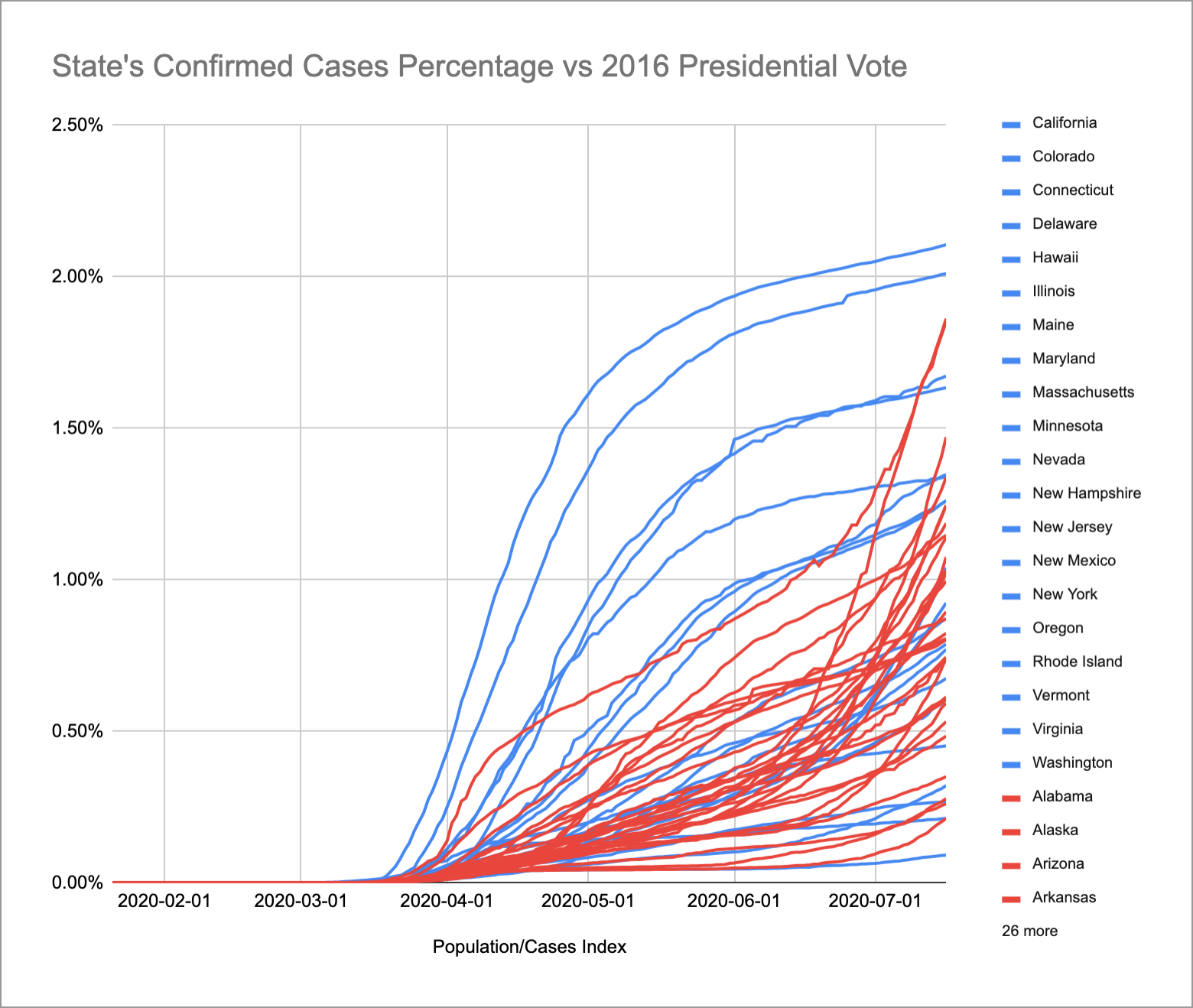
I wanted to get a sense of how effective masks were in curtailing the pandemic spread. Unfortunately, I couldn’t find a source of data per state for that. (This NY Times article is close, but they don’t list out the counties.) But I did find a Wikipedia article on political party strength. So I combined that with the New York Times covid data repo and came up with the graph above (here’s the spreadsheet). The color indicates which party that state voted for in the 2016 elections. All the lines have been normalized per state population.
I was stunned. When this all started, I figured it would mostly be an issue in the states that are more densely populous, which is mostly the blue states. So it’s not surprising to see higher positive case numbers for the blue lines. But I was shocked to see how much faster the red lines were growing in the last few weeks. The highest blue lines are New York, New Jersey, Rhode Island, and Massachusetts. The highest red lines are Louisiana, Arizona, Florida, and Mississippi.
I think this is a pretty clear indication of the effect of politicizing what should absolutely not be a political decision. We have medical experts, epidemiologists, data scientists, and examples from other countries. Politicians should be taking their cues from them.
Here’s another graph, focusing on California, which is where I’m from so I’m a little more familiar with it:
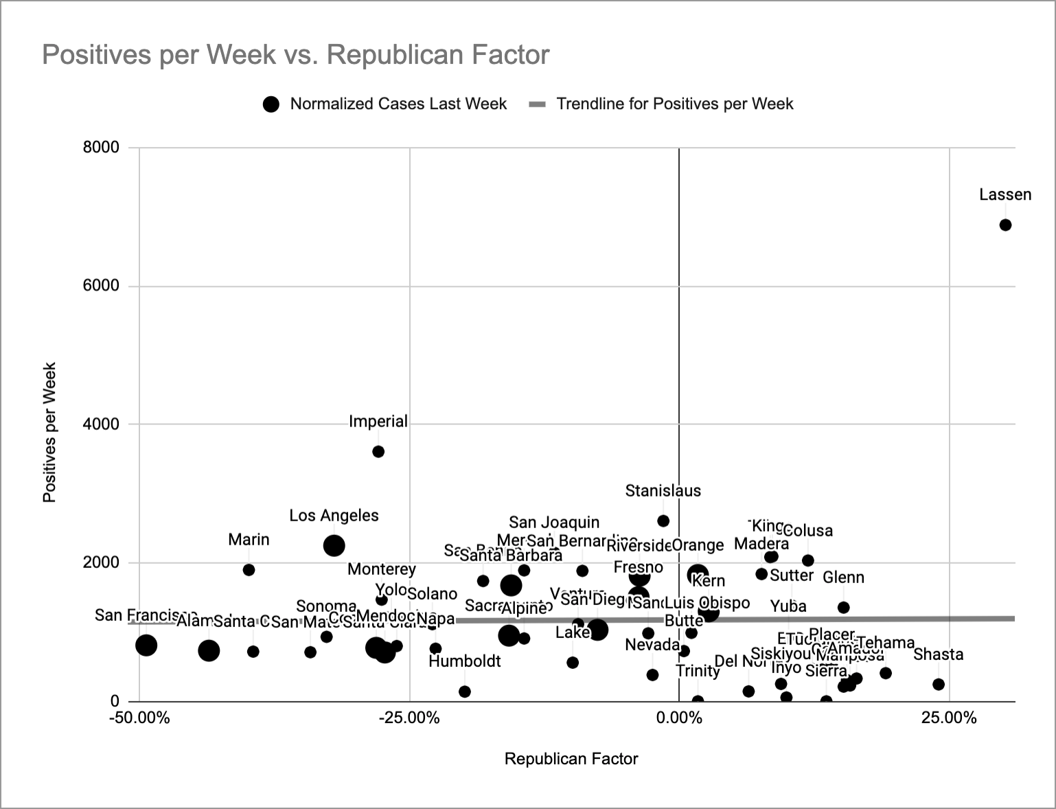
In this one, I graphed the number of positive cases last week (normalized per million people) versus a “Republican factor” that I got from this Wikipedia article on voter registration numbers per county (further right is more Republican). I’ve also made the dots for the 12 biggest counties bigger for easier visibility. As you can see, California isn’t an entirely blue state.
The thick gray line going through the middle of the dots is the trend line and it’s pretty flat. That means there’s no correlation between political party infection rates in California. But looking at the counties I’m most familiar with, I see that San Francisco and Alameda are pretty low and I also know that mask usage in the SF Bay Area is pretty good. But I’ve heard from friends in LA that mask usage down there is pretty bad and sure enough, Los Angeles has a significantly higher infection rate right now. So from this, I take away two things:
- Leadership is important. I believe the reason we don’t see any political correlation at the county level is that the Governor sets the rules for the entire state. Each county has to follow the state guidelines.
- Individual choices are important. I believe the reason we see such a variation between Los Angeles and San Francisco is that individual people are choosing whether to obey the social distancing and mask guidelines. The guidelines can only do so much. People still have to be responsible.
But I think there’s also room for optimism for red states. Right now, they still have a lower number of positive cases. It’s possible for individual people in those states to choose to take more precautions beyond what their Governors state and stay that way.